How Your Website Colors Affect Traffic Conversion?
Tags: A/B testing • Brand image • call to action • colors psychology • Consumer buying behaviour • conversion optimization • CTA • traffic conversion
Colors play an important role in marketing whether it is online marketing or traditional products and services marketing. When it comes to online marketing, businesses make efforts to influence consumers and prospective customers through various marketing touchpoints such as websites, mobile apps, emails, and social media platforms to name a few.
It’s a fact that prospects make up their mind within 90 seconds of interacting or viewing a product and almost 90 percent said colors had a major role in deciding on the product.
Additionally, almost 90 percent of impulse buying decisions are due to influence of the colors.
So, it is a known fact now that colors have a powerful psychological effect on consumers’ decisions. There are no set rules for selecting color choices; rather general guidelines based on years of research that govern according to the principle of associative learning.
Website designing or Mobile App UI designing takes up a lot of hard work and effort in planning for every page’s layout, designing it, and deciding on the most important thing that attracts people – the colors.
Colors are important not just because they make our life colorful but also because they play a critical role in influencing our buying decisions and our behavior in everyday life.
Colors have a powerful psychological influence on our brains and our prospective customers are no different.
Many studies have shown that just as in our lives, colors play an important role in web designing, UI designing, and product packaging. The color combination and the use of color patterns in the design influence the decision-making behavior and the level of interactivity on the website and mobile apps respectively.
Color Psychology
There is a whole science behind the study of colors and their impact on human minds and their buying behavior. It is called colors psychology and it evaluates the impact of colors on human psychology. It is a branch of a much broader behavioral psychology.

The researches have shown that a consumer takes about 90 seconds to develop an opinion about a product. The majority of the time is spent choosing the color. Another study has shown that a correct set of colors or color schemes can impact the bottom line and increases site conversion by as much as 24%.
It is a must study field for every business owner or product manager looking to have a high conversion from their website or web-store by selecting the right colors for the designs.
How to Enhance Conversion with the Help of Right Colors in the Website?
Color has omnipresence in the world and learning where to use it will help the website in converting more and more of the traffic into business/leads. A great website or graphic designer knows how to manipulate colors in their artwork to achieve the desired results.
In web designing, elements such as borders, headlines, pop-ups, backgrounds, and Call-to-action buttons, are only effective as long as their placement and color selection is right. You should choose colors according to your target audience and the product/service you are promoting.
Not all colors invoke the same degree of emotions and thus use of colors in the right combination can help increase website conversions.
Researches show that women prefer blue (35%), followed by purple and green whereas men prefer blue (57%), green, and black. So the colors should be chosen wisely, keeping in mind the target audience. Colors attract people and play an important role in influencing emotions.
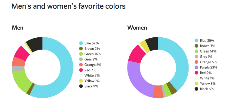
According to color theory, each color has a different result; the following is information about some colors and how they influence. This will help understand how they can be used in your designs:
#1 Blue
It is the most used color for the website and not without a good reason. Both males (57%) and females (35%) like the color blue very much.
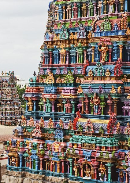
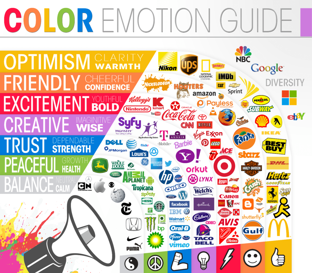
It is a preferred color for communicating messages in marketing. Blue color represents trust, peace, order, and loyalty, which is why popular websites like Facebook, Twitter, Skype, Dropbox, and PayPal use it.
No wonder, not just in designing and marketing, the blue color is also one of the most preferred color choices for Cars in India. According to ‘BASF Color Report For Automotive OEM Coatings’, blue (7%) is the 5th most popular choice after White, Red, Grey, and Silver.
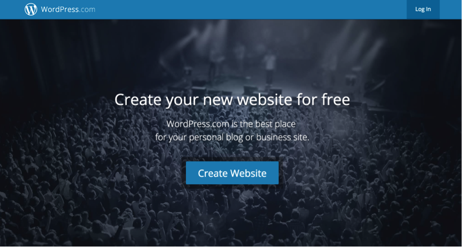
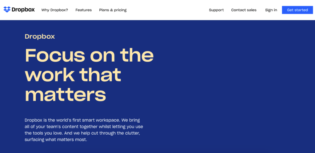
Blue color elicits enthusiasm, trust, security, and safety and thus is the preferred choice for corporate site design and Call-to-Action (CTA) buttons.
#2 Orange
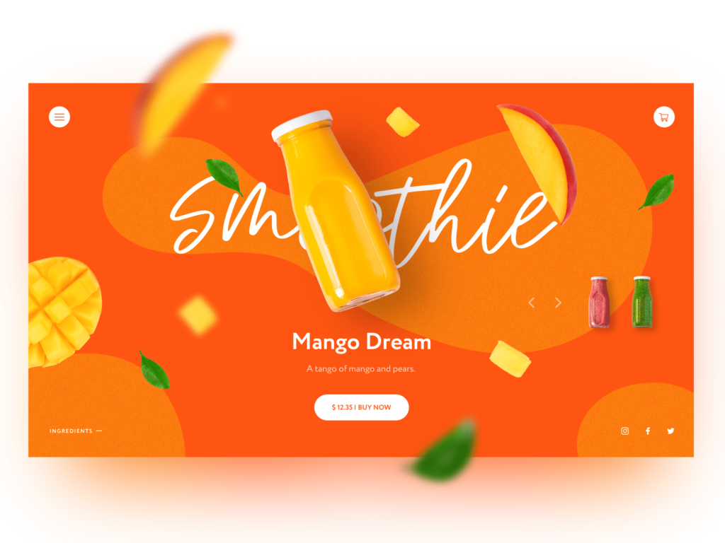
Orange is the color choice for fun, happiness, and is largely used for aggressive call-to-action (CTA) elements aimed at achieving higher conversions. This color is used when merchants want people to do impulse buying such as in Clearance sale and fast food joints.
Online web-stores use orange color for call-to-action buttons such as Subscribe, Buy or Sell now. It helps in stimulating physical activity and consumer purchasing behavior.
As it is highly stimulating, orange and red is used by companies and designers to attract attention for hot deals or free offers.
The orange color is mostly used for sports and children’s products.
#3 Yellow
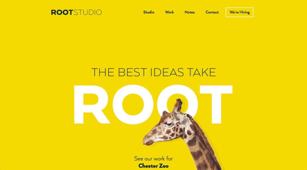
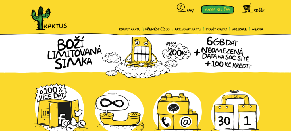
Yellow color invokes strong feelings and thus the right mix of yellow can help grab the attention of the website visitors which is likely to improve conversion. As yellow color instantly grabs attention and creates excitement, it is often used to overwhelm customers and energize them to buy products immediately.
But if used excessively, it can be abrasive and cause visual fatigue. As it grabs attention instantly, yellow color is preferred choice for traffic signs and warnings.

Yellow, when used in moderation, helps in grabbing the attention of the visitors be it on your website or customers passing by your store window. It has an instant effect on the brain by stimulating the attention-seeking area. That is why beyond a certain point it increases the frustration making the visitor angry.
Excessive exposure of yellow color will result in eye fatigue as it reflects most of the light.
Color tip: So, if you are looking to increase conversion or grab the attention of customers, use the yellow CTA elements. As with any color, yellow color too elicits a response that is different in different individuals. Thus not every business may not get the same conversion response.
#4 Green
It is an ideal color representing the environment and outdoor natural products.
It is the symbol for nature, fresh, growth, and abundence. It is said to help in improving the creativity of a person. Kroeber-Riel back in 1979 confirmed that the outcome of advertising depends on arousal as impact aims at increasing the consumer’s long- term memory as compared to short-term memory.
Green color is part of cool group along with blue and violet and colors such as red, orange, and yellow are part of warm group. The green color specially the forest green gives an impression of an upscale product/service and thus it is mainly used with nature and fresh and delicious fruits and vegitables.
So, green doesn’t really relate to anything except nature, fruits, psychology, and peace. This is the color of your choice if you deal in said business categories to show your products as fresh and healthy and looking for higher conversion.
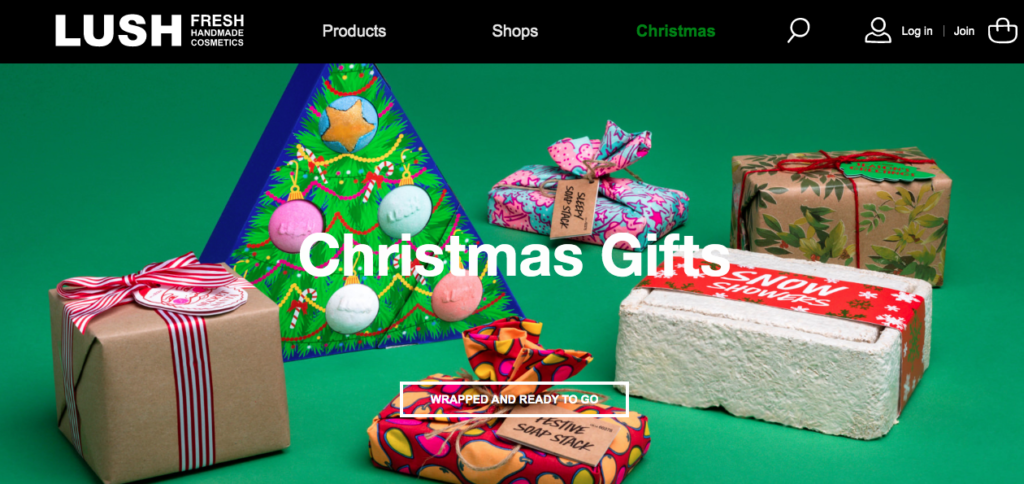
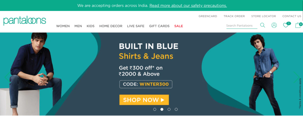
One of the best example of use of green color is in the Reliance Fresh stores where customers have reported feeling fresh and at ease when shopping. Pantaloons is another example which customers remember for ease of shopping.
#5 White
White color is an easily ignored color because it is not yet decided whether it’s a color or not. But in the web designing industry, it doesn’t make any difference as it’s the most widely used color.
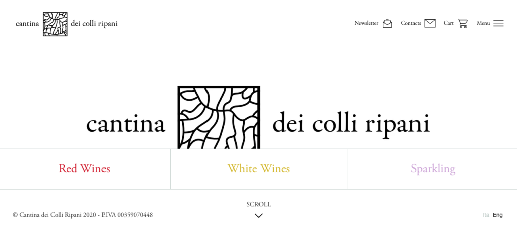
White is primarily used as a background by the majority of web designers to highlight the text, images as when text used with white, they get highlighted.
White color gives a luxurious and uncluttered look to the overall design. It has been observed that a cluttered design puts-off a customer, decreasing the overall conversion rate.
As a color, white represents a sense of freedom, spaciousness, and breathability. See how a beautiful white form has been designed by Dropbox on a blue background to stand out. A visitor clearly sees the form and knows the next step already. A white text on a black or a dark background really stands out to the eyes.
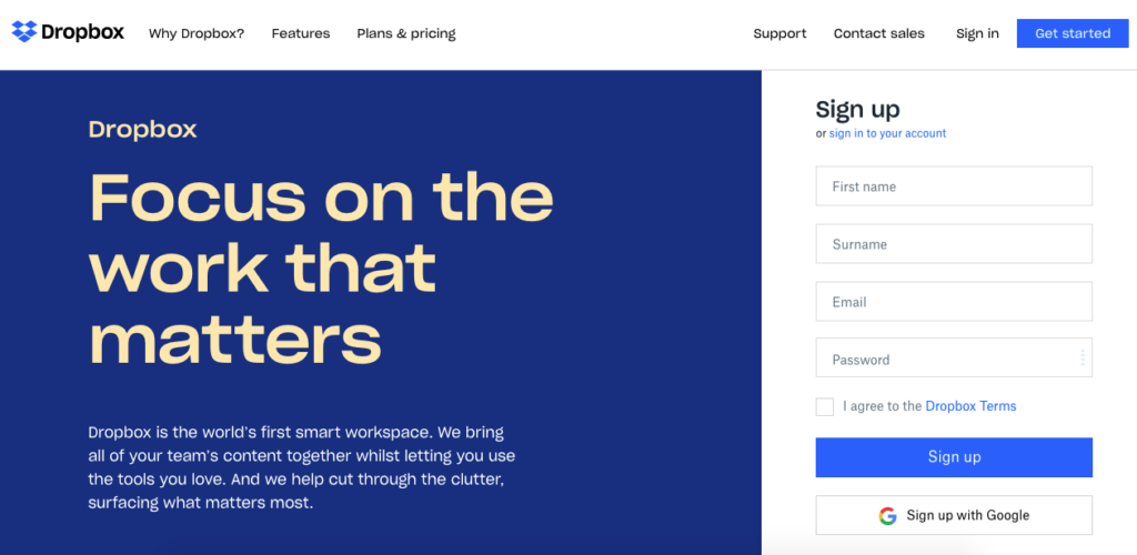
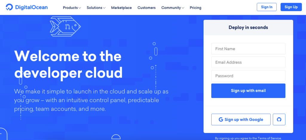
So, if you are really looking for high interactivity from your pages and better traffic conversions, use the color white liberally with a contrasting background and text color.
Be careful not to use too much white as it becomes too snooty, confusing, and less interactive. You can see a higher bounce rate for your landing page.
#6 Black
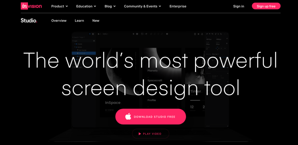
It is a color that represents power, elegance, sophistication, and expensiveness. Luxury designers and expensive commercial websites majorly use it. Brands such as Louis Vuitton, Citizen Watches, Lamborghini use black color as the predominant colors on their website and in their marketing communications.
When it comes to conversion strategies, black color instantly attracts and this is the reason why it is color of choice for texts and color accents.
Even the logos of some of the top brands in the world like Apple, Louis Vuitton, Ralph Lauren, MTV, SONY, Addidas, and Disney to name a few are in black color.

#7 Red
The basic purpose of using red color is to highlight important information and give emphasis to the call to action elements. Be it banners, text, or buttons, red color attracts attention and is a dominant color.

Red is associated with love, war, and warnings; thus it takes on different meanings but the underlying meaning is that of showing important information to enhance conversion.
A/B testing of a landing page design with different colored call-to-action buttons, namely green and red, showed that the page with the red button outperformed the page with the green button by almost 21%.

Everything on the page including the message and layout was the same except the CTA button color. This showed that more customers clicked on the red button than the green button and thus increase in conversion for the red button landing page.
With these A/B testing results, it is all the more imperative to use the right combination of colors along with the right message copy to improve the landing page conversion.
Final Words
The world is a colorful place, and so is the internet. You can achieve a lot with your design if you master the use of colors. A well-designed website can attract a lot of customers, greatly improving the bottom line through conversions.
To help you make the best color choices, here are some tools for your reference.
- List of Hex codes and color schemes used by the world’s best brands.
- Color Goodies
- Brand color quiz
- Eye Dropper chrome browser extension
- Color wheel for combining colors
- 60-30-10 rule for chosing colors
- Generate Color Palettes
- Adobe Color wheel
 Previous Post
 Next Post
