What is Conversion Rate Optimisation (CRO)? Learn Basics To Holy grail
Tags: conversion optimisation • conversion optimisation tools • Conversion Rate Optimisation • CRO • cro best practices • cro conversion • cro marketing • forms optimisation • on-site conversion • website conversion optimization • website performance optimisation
What is Conversion Rate Optimisation (CRO)? Well, before I answer that question, let me start off with a familiar scenario, where I’m sure every webmaster or business owner would have been at some point in time.
Have you been in a situation where your website is getting great or decent traffic but visitors are not filling up the inquiry or contact us forms and thus very little leads coming in? You must be wondering- “we have a great looking site but what is wrong and why the website isn’t generating any leads?”. With a lot of waiting for the website to finally perform better, one day you start doing some visible changes to the website’s flow such as changing the color of buttons etc with the hope to see some improvements in traffic conversions. Slowly, you see leads coming in!
In above example, knowingly or unknowingly, you implemented the activities of conversion based optimization practices. That is, activities that are done to the website which helps in increasing your website traffic conversion into leads/registration/purchase is called conversion rate optimisation (CRO) services or simply conversion optimisation (CO). It is a fact that almost 63% of marketers and web performance managers optimise the website based on intuition.
Great design isn’t enough these days! When a prospect lands on the website, it’s more like a date! Either you impress the date with great design and contents (what your website has to say) to win a second date or you lose the prospect’s interest, for a second date. There are so many great looking websites out there but how successfully you can hold your date’s interest is the winning strategy.
Every business dreams of getting a sales-accepted lead (SAL) every day with choked sales funnel but how many actually realise their dreams of generating enough SAL leads? When businesses find their website not performing well, they use various traffic conversion optimisation strategies along with testing various conversion optimisation tools (for heat map analytics, browsing behaviour, click tracking, customer feedback surveys etc) with the hope of improving website conversion rates (CR).
Every landing page in a website, be it Home page, About Us, Service page or even the Contact us page, is designed to achieve certain conversion goals. Similarly, every visitor, when visiting a website, has expectations and when they see it fulfilled, they progress to the next step in the conversion process to achieve the page goal.
Home Page Conversion Rate Optimisation Tips
The Home page is the most valuable asset for any website and apparently, more often than not, it is the home page that ranks the most in search engines. Besides, it’s the gateway to rest of the website. So, the home page should always be tested to have the best conversion elements such as call-to-action elements, persuasive content copy, confidence building elements (awards/testimonials/reviews etc) and more.
Remember, what worked for one business doesn’t mean it will work for you too. So, it’s always recommended to test the information/best practices against your website’s conversion problems multiple times until they work. We have seen that conversion elements that worked for one client didn’t show visible results for another client. So, tests, tests, and more tests are the key to conversion rate optimisation success.
Coming back to conversion tips for the home page, below are the lists:
- Home page should be clean and uncluttered. Many a time, clients like to show too many things on the home page in the quest to show all they can do or offer but end up confusing visitors with poor conversions.
- Sliders should have persuasive text copy with proper call-to-action buttons to take visitors to appropriate inner page for further action
- Home page should highlight value proposition of your business. Why should they do business with you and where you are different from other agencies?
- Improve clarity of the design with contrasting text color with images. Try using high-quality images.
- Have at least one form on the home page with clear mentioned mandatory and optional fields. Do not have too many fields in the form. Seriously it helps!
- Display confidence building elements such as testimonials, client’s logos or reviews to arouse interest in your business.
Here are some of the great home page designs
The Sketchapp home page design is beautiful in the sense that it’s clean and uncluttered using a dark colored background with contrasting coloured text. The entire focus of the design is on what the product does and a button to buy it or try it. The intended goal of the landing page – Buy Now – stands out so much!

The home page of RS Media Labs (our parent company ;)) uses bold images to create a visual impact along with highlighting the value preposition prominantly. With a large call-to-action button and a cartoon charector to intrigue visitors, we have been quite successful in our conversion rate optimisation efforts with an above average conversion rate.

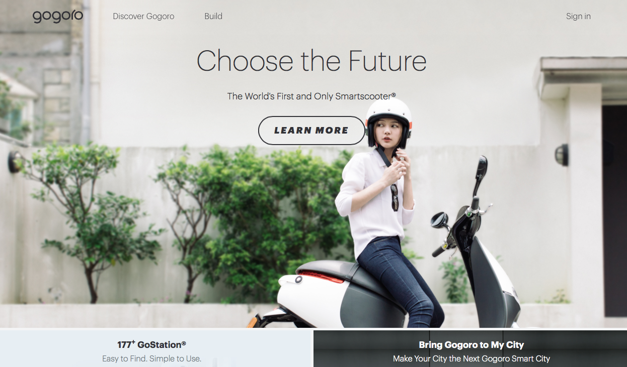
The Gogoro website landing page is beautifully designed using great combination of clear and attractive image, USP text right up there and a call-to-action button to pull them in on an inner page which does a great job is impressing the visitor. So clear flow defined for a visitors to follow and lead up to the goal.

Evernote has been our favourite since long. Here the home page is set clear with an uncluttered layout and clearly defined call-to-action button that stands apart as a logical next step. See how the features of the App is clearly defined connected to a user persona to instantly relate to visitors’ inner psychology and at the same time presenting the next action they should take.

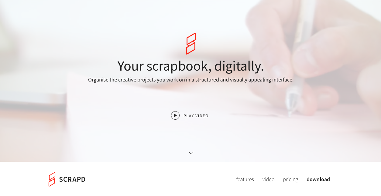
Scrapd home page is another beautiful design created for conversion. The simple yet effective design has a video playing in the background showing what all can be done with the app. It’s another effective way of showing the benefit right there instead of letting the user find out themselves.

Forms – increase your lead conversions with best practices
Interactive forms are an integral part of our websites and making sure they are as user-friendly as rest of the website is very important. They say forms speak with your prospect customers and if they do not ask the right questions (form elements visitors fill) or ask too many questions, they are not set-up properly or optimised for lead generation.
As the objective of the forms is to generate leads, so they are at the center of all of the lead-generation activities. There are beautiful forms, boring forms, and forms that scare your prospects away by asking too many questions. Keep them short and simple and they will show surprising results!
It has been seen that forms are the most overlooked area in website conversion rate optimisation checklists.
- Their placement on the page (above the fold/below the fold) matters, as it affects how many times the forms are filled or ignored.
- A defined Call-To-Action title that highlights the problem you intend to solve. The call to action should be clear about the action the visitor should take and it should be easy to take.
- Keep it simple! Only include fields that are must as rest of the details can always be acquired during the course of communication with them. Keeping the form too lengthy will drive away visitors.
- Clearly mention compulsory fields as this increases comfort level. It has been argued that whether to ask for the contact number of prospects or not. Most of the visitors are wary of giving away their details lest they end up getting too many calls from desperate salespeople. Include the contact number as Optional field, if you must include it in the form.
- Clearly mentioning “Privacy terms” will further increase the comfort level of prospects. Furthermore, make sure NOT to mention “SPAM” in the privacy text as this too scares away prospects from filling up the form.
- Use appropriate words on Call-to-action buttons instead of default “Submit” or “Click here” to increase conversion. Try to write text to relate to action the visitor is taking such as “Call me now“, “Get in touch with me now!“, “Send me the eBook now“, “Register me now” or “Click here to know more about our SEO packages” etc. Let visitors connect with the action statement!
Below is an info-graph which gives information on what works best for contact forms and how to optimise them for high conversions.

Optimise About Us landing page
About us is one of the most visited pages on the website and if it isn’t for you, then there is something wrong as it only shows most of the visitors don’t care to know about who you are. Or the page is obscure and buried deep, not easily visible to the visitors.
A careful look at the website analytics will show how the page is performing in terms of the bounce rate and what percentage of traffic is dropping off from it. If a large percentage of visitors are dropping off, it’s time to rethink about the page design and information architecture.
Carefully do a customer journey analysis along with page copy optimization to see if it brings results. Customer journey mapping, browser behaviour, click tracking can be done with the help of Eye-tracking and heat map analysis tools. Almost 95% of companies who did a customer journey mapping and optimised the content copy saw an improvement in traffic conversion in general. Businesses need to regularly evaluate their prospects’ needs and adapt quickly through innovation.
The About page is where most conversion improvement can be achieved provided the visual changes or the content copy is written to play with visitor’s psychology. The conversion goal should be to convert passive visitors on the website into active users who engage with the content and are persuaded to take the next step of either filling up a form or purchasing products. The secret to more conversions is knowing what your prospect wants from your business.
As part of conversion and content marketing strategy, the about us page should highlight the benefits your prospects will get, instead of what all you, as a business, can do. It is more about “YOU” than “WE”. There are thousands of companies out there like you, who can do anything or everything for their clients, but as an expert agency, you should highlight what is one or two thing that you are best at that will benefit your prospects.
Additionally for better conversions and to show where you are different from your competitors, About us page is the right place to show your value proposition. Good news is you know where to show your value proposition but the bad news is, the majority of companies struggle to define their value proposition.
Don’t try to fake it on About us page! Be real about your company and mention who you are, as prospects are likely to better connect with you when you are being real and honest.
Optimise Shopping Cart for higher conversion rates
Ecommerce websites have very poor website conversion statistics. On an average 55% – 75% cart abandonment rate. Shopping cart abandonment rate (CAR) is the most dreaded statistic for online retailers and majority of their website performance optimisation activities or conversion based optimization tasks are related to reducing the CAR percentage. Almost 73% of retailers have no or little clue about what is not working in their shopping cart process.
I too have personally abandoned quite a few shopping cart on popular shopping stores while reviewing and studying their conversion optimisation strategies; some out of frustration, some due to a lot of steps, some due to lack of offers during the check-out process, and some due to high cost difference with no justification for why they are charging higher cost.
So, as an online retailer, if you do not know why your customers aren’t buying or abandoning your shopping cart, you are leaving too much on the table as with time it will further reduce your online retail conversion rates.
For online retail business, like any other businesses, we need to understand the buyer personas and their individual behavior so that your retail store caters to all of them. Some buyers may not purchase as they are only here to compare costs. Some aren’t ready to buy yet and they are currently identifying and short-listing products they will buy soon and in the near future.
Future prospects will look for “Add to Wishlist” or “Recommend this to a friend” feature to save the product for later purchase. Not having these feature on the ecommerce website will only drive them away unless you offer a unique product not offered by anyone else.
Having a simple registration process saves time and frustration for the customers and yes, don’t force customers to sign-up before purchase as this will only drive them away. Additionally having an option for Guest checkout saves lot of prospect customers from abandoning the shopping cart or the website.
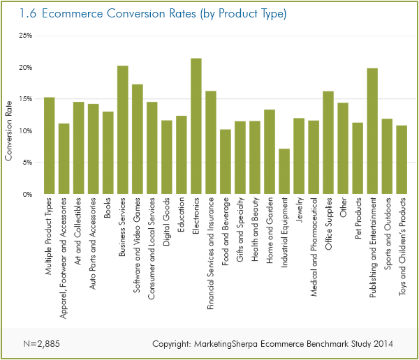
Below is a chart that shows website conversion rates for Ecommerce web stores. It says retailers selling more products online have greater conversion rates compared to retailers selling one or few products.

Electronic products have 24.1% website conversion rates, computer software & video games have 19.5% conversion rate, and office supplies have 18.3% conversion.
Test, test and more tests! It is always recommended that, no matter how sure you are of your idea or on your inferences, it is always worth testing to confirm the coversion results. How to increase website conversion rate is a hot topic these days and how successful you are in your conversion improvement is a matter of approach and how best you understand your buyers’ personas.
 Previous Post
 Next Post
